Client
VanArs
Project
Sales & Marketing Intelligence System For Manufacturing
Application Type
Business Intelligence & Reporting Management, ERP
Industry
Manufacturing
Business Requirements
VanArs’s CMO wanted to increase market share and discover growth opportunities. For some reasons, VanArs’s market share was declining, due to the improper vision of company’s statistical data and irregular strategies.
To overcome these issues, a system was foreseen with the dashboards and the set of reports which can be observed by the Chief Marketing Officer (CMO) to keep an eye on the industry and his company’s market share, product volume, sales, and sentiment.
The Solution
The manufacturing process needs to be a well-oiled machine to prosper and the best way of achieving that is to have visibility on every procedure while seeing the big image. After analyzing VanArs current system problems and company’s data, Power BI was chosen as the Business Intelligence tool to create new system for VanArs.
Multiple dashboards with various executive tiles were created to present the company statistical data in summary form. Comparison charts which can help to understand how well the company planned for the year and investigate areas with huge deviations from the plan.
Manufacturers need to collaborate, monitor and communicate on available live data to achieve operational excellence. This system helps to monitor real time data from multiple sources into one dashboard and drill down to identify issues when necessary. Getting real time alerts with mobile apps and make the operations more efficient to achieve greater agility and minimize response times.
Monitoring the supply chain end-to-end and identify problems and bottlenecks before they reach critical processes. Sharing the dashboards with suppliers and partners so that they can adjust to the latest information available, making the processes leaner and smarter. Monitoring quality inputs and outputs from all sources, including the customers, to make quick and meaningful decisions that can improve manufacturing quality.
Key Highlights of the Solution Implemented
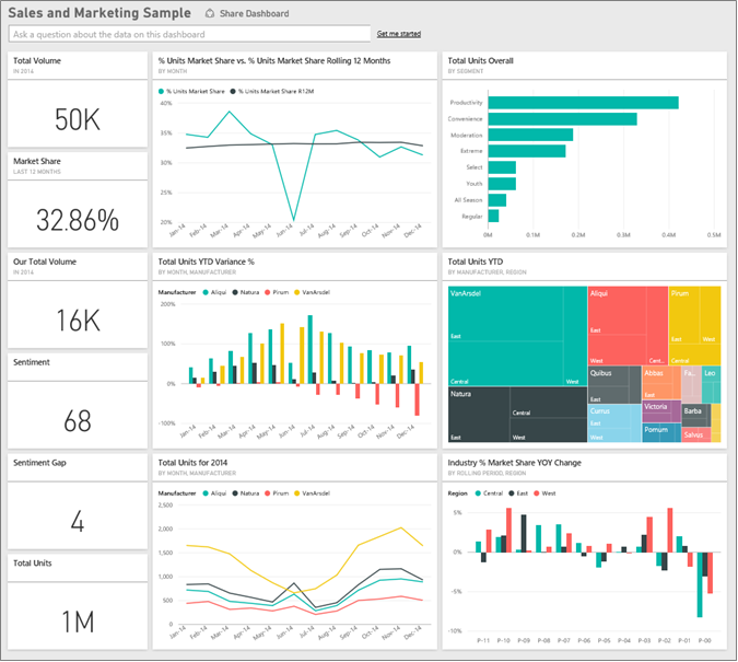
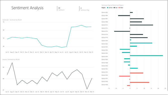
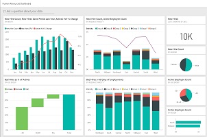
- CMO Dashboard was created with the market share, sales, and sentiment. It can be further drilled down to see the data broken down by region, time, and competition.
- The number tiles down the left column show industry sales volume this past year, market share, sales volume, sentiment score, sentiment gap, and total units sold.
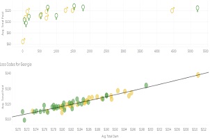
- The top line chart shows how the market share fluctuates over time. The market share really drops in June. Also, R12M (Rolling 12 Months) share which was increasing for a while, is starting to stall.
- The biggest competitor is Aliqui (evident in the middle column chart tile.)
- Most of the business is in the East and Central regions.
- The line chart at the bottom shows that the dip in June is not seasonal – none of the competitors show the same trend.
- The two “Total Units” tiles show units sold, by segment and by region/manufacturer. The largest market segment for the industry are Productivity and Convenience.
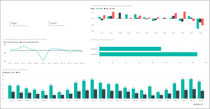
- Market Share Report
- The “Total Category Volume by Segment” bar chart in the middle on the right, is filtered to show top 2 segments. Filters on the right can be expanded to select the visualization. Under Visual Level Filters, that Segment is filtered to include only Convenience and Moderation. Filter can be modified by selecting Segment to expand that section and then checking Productivity to add that segment as well.
- Line chart shows the monthly market share and 12 month rolling market shares. Rolling 12 months data help in smoothing out monthly fluctuations and shows the long term trends. By selecting Convenience and then Moderation in the bar chart it display how much fluctuation in market share there is for each segment. The Moderation segment shows much more fluctuation in market share than the Convenience segment.
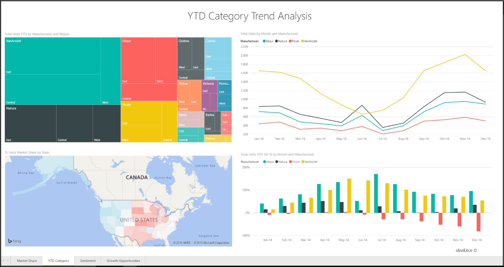
- YTD Category Trend report
- Sentiment Report
- Tweets, Facebook, blogs, articles, etc. contribute to sentiment which is shown in the two line charts. The sentiment chart in the top left shows that sentiment for our products were pretty much neutral up until February. Then a big drop started in February and bottomed out in June. What happened to cause this drop in sentiment? In February, several articles and blog posts rated VanArs’s customer service the worst in the industry. This bad press had a direct correlation to customer sentiment and sales. VanArs worked hard to improve customer service and customers and the industry took note. In July positive sentiment started to rise and then reached an all-time high in the 60s. This uptick in sentiment can be seen reflected in “Total Units by Month” on pages 1 and 3.
- Competitive Product Analysis Report
- The bottom left chart shows all the category segments except for VanArs’s two strongest segments. Filtering by category by clicking on the bars helps identify potential expansion areas for VanArs. The Extreme and Productivity segments display how these segments are growing faster than others.
Benefit Impact On Business
The real time visibility provided by this system made the company decision taking processes more efficient and faster. CMO was able to recognize on which months VanArs’s market share are declining and identify the significant dips. The TreeMaps in the reports were very helpful to know the competitors and their product volumes.
After six months, this business intelligence system increases the VanArs’s revenue by 18%.
- The business revenue increased by 18%
- Performance increased by 35%
Prime Focus Points
- Drill down investigation directly from the dashboard
- Sentiment gap to identify: which districts have the highest sentiment gap, how can management capitalize on this, and discover ways to replicate it in other districts.
- Natural Language Queries were also implemented to support searching the data as per business need
- Combination of various and relevant charts were implemented to provide better visualizations to the statistical data
- Track key performance indicators in real time: machine utilization, process efficiency, costs, inventory levels, losses and cycle times.
- Multiple data sources were used from diversified data sources from various locations in the form of Excel files, data stores, text files etc. All were connected in this system to get the unified business intelligence platform.